Add a feature complete messenger to your Refine app
This tutorial will show how to add a full-featured messenger to your Refine powered React app using our messenger component.
Have your favorite code editor ready, and let's get started!
Prerequisites
We assume you are well acquainted with the Refine API and have a Refine powered app ready. This tutorial takes advantage of Ant Design components for layout, but you may easily adapt it to other UI Frameworks as well.
You will need:
- A Weavy environment
- Node.js
- Your favorite code editor
1. Prepare your Refine app
Make sure you have a Refine powered app. For this tutorial we make use of NextJS with Ant Design.
Refine has a ready-to-go Authentication with NextAuth.js example for this.
npm create refine-app@latest -- --example with-nextjs-next-auth
2. Configuring Weavy
We need Weavy to be configured with an environment url and authentication to get the components running.
Make sure you have followed the tutorial for What to do first with Refine to configure authentication.
3. Add navigation a helper
We will add a stateful navigation layer on top of the refine navigation. This will take advantage of #hashes in the URL. To be able to easily take advantage of hash changes, we need to add a useHash() hook in /src/hooks/hash/useHash.ts
"use client";
import { useParams } from "next/navigation";
import { useEffect, useState } from "react";

/**
 * Gets the hash from the current location.
 * @returns The current hash without a leading #hash sign
 */
const getHash = () =>
  typeof window !== "undefined" ? window.location.hash.replace("#", "") : "";

/**
 * Returns the hash from the current location.
 * Updates when the hash is changed by the browser or by next navigation.
 *
 * @returns Any current hash without leading #hash sign
 */
const useHash = () => {
  const [isClient, setIsClient] = useState(false);
  const [hash, setHash] = useState(getHash());
  const params = useParams();

  useEffect(() => {
    const handleHashChange = () => {
      setHash(getHash());
    };
    window.addEventListener('hashchange', handleHashChange);
    return () => {
      window.removeEventListener('hashchange', handleHashChange);
    };
  }, []);

  useEffect(() => {
    setIsClient(true);
    setHash(getHash());
  }, [params]);

  return isClient ? hash : "";
};

export default useHash;
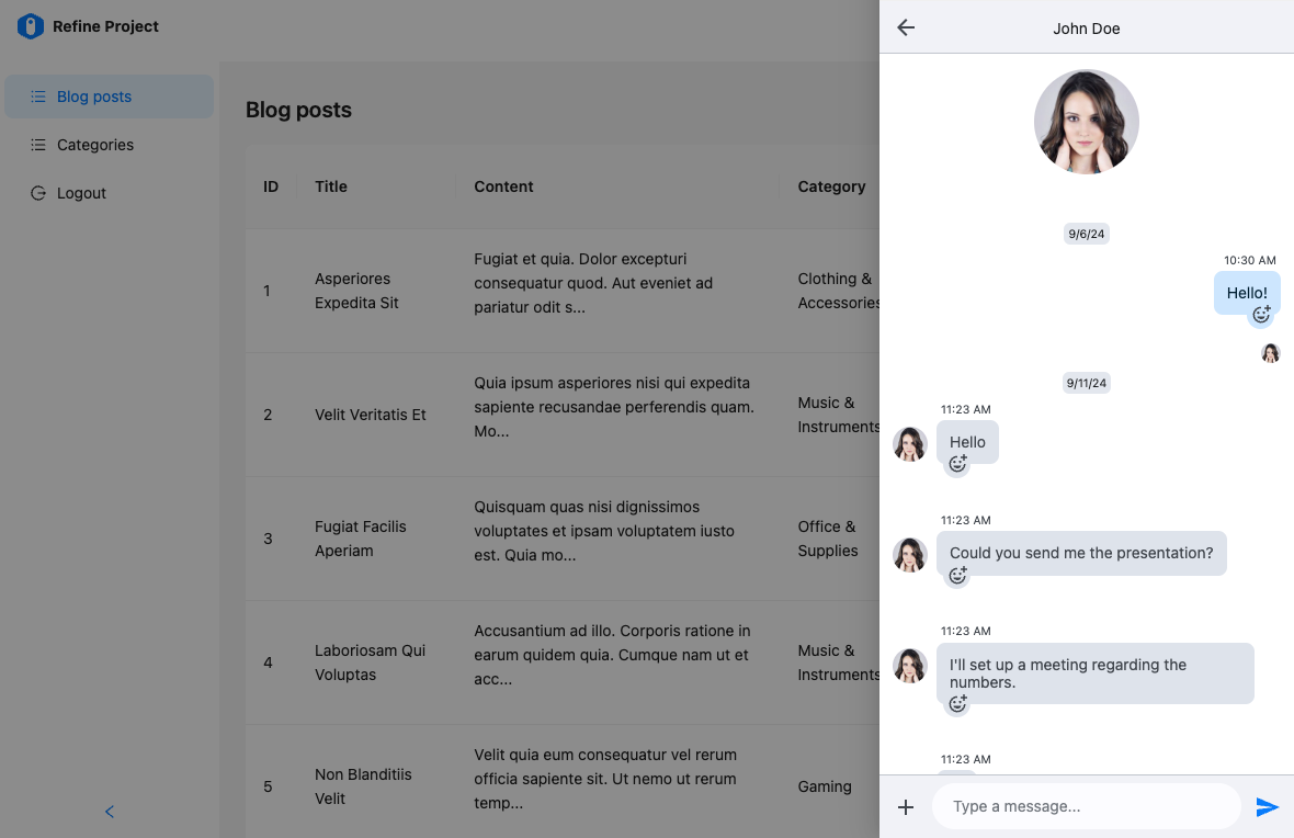
4. Create a Messenger component
We're adding the messenger to a drawer triggered from the navigation header. We need to add a button and a drawer. Then we need to make it open on specific navigation requests.
- Create a new component in
/src/app/components/weavy/messenger.tsx. - Import a
<Drawer>component fromantdand make it use anopenboolean state. Set the initial state tofalse, so the drawer will be hidden initially. - Import the
useHashhook we created and connect it to theopenstate and make it listen to the#messengerhash. Whenever the#messengerhash is present in the URL, the drawer will open. - Import a
<Button>component fromantdand make it toggle theopenstate on clicks. Set the icon attribute to the<MessageOutlined />icon from@ant-design/icons. - Import the
<WyMessenger>component from@weavy/uikit-reactand place it in the drawer.
import React, { useEffect, useState } from "react"
import { Button, Drawer } from "antd"
import { WyMessenger } from "@weavy/uikit-react"
import { MessageOutlined } from "@ant-design/icons"
import { useGo } from "@refinedev/core"
import useHash from "@hooks/hash/useHash"

export const WeavyMessenger: React.FC = () => {
  const [open, setOpen] = useState(false)
  const go = useGo()
  const hash = useHash()

  const showDrawer = () => {
    setOpen(true)
  }

  const closeDrawer = () => {
    setOpen(false)
    if (hash === "messenger") {
      // Clear the hash when closing the drawer
      go({ hash: "" })
    }
  }

  useEffect(() => {
    // Show the drawer when the #messenger hash is set
    if (hash === "messenger") {
      showDrawer()
    }
  }, [hash])

  return (
    <>
      <Button
        type="default"
        onClick={showDrawer}
        title="Messenger"
        // @ts-expect-error Ant Design Icon's v5.0.1 has an issue with @types/react@^18.2.66
        icon={<MessageOutlined />}
      ></Button>
      <Drawer onClose={closeDrawer} open={open} styles={{ body: { padding: 0, display: "flex" } }}>
        <WyMessenger />
      </Drawer>
    </>
  )
}
5. Add the component in the layout
Now that the component is ready, we just need to add it in our navigation bar. To make everything align nicely, we'll change the <Space> layouts to <Flex> layouts.
- Open
/src/components/header/index.tsx. - Change the outer
<Space>layout to a<Flex align="center" gap="small">layout. - Change the avatar
<Space>layout to a<Flex style={{ marginLeft: "8px" }} align="center" gap="middle">layout. - Import and add the
<WeavyMessenger />component you created last in the outer<Space>layout.
"use client"
import { WeavyMessenger } from "@components/weavy/messenger"
import { ColorModeContext } from "@contexts/color-mode"
import type { RefineThemedLayoutV2HeaderProps } from "@refinedev/antd"
import { useGetIdentity } from "@refinedev/core"
import { Layout as AntdLayout, Avatar, Flex, Switch, Typography, theme } from "antd"
import React, { useContext } from "react"

const { Text } = Typography
const { useToken } = theme

type IUser = {
  id: number
  name: string
  avatar: string
}

export const Header: React.FC<RefineThemedLayoutV2HeaderProps> = ({ sticky }) => {
  const { token } = useToken()
  const { data: user } = useGetIdentity<IUser>()
  const { mode, setMode } = useContext(ColorModeContext)

  const headerStyles: React.CSSProperties = {
    backgroundColor: token.colorBgElevated,
    display: "flex",
    justifyContent: "flex-end",
    alignItems: "center",
    padding: "0px 24px",
    height: "64px",
  }

  if (sticky) {
    headerStyles.position = "sticky"
    headerStyles.top = 0
    headerStyles.zIndex = 1
  }

  return (
    <AntdLayout.Header style={headerStyles}>
      <Flex align="center" gap="small">
        <Switch checkedChildren="🌛" unCheckedChildren="🔆" onChange={() => setMode(mode === "light" ? "dark" : "light")} defaultChecked={mode === "dark"} />
        {(user?.name || user?.avatar) && (
          <Flex style={{ marginLeft: "8px" }} align="center" gap="middle">
            {user?.name && <Text strong>{user.name}</Text>}
            {user?.avatar && <Avatar src={user?.avatar} alt={user?.name} />}
          </Flex>
        )}
        <WeavyMessenger />
      </Flex>
    </AntdLayout.Header>
  )
}
6. Done!
The messenger is now ready for use. We have also prepared the drawer for navigation requests. Take it for a spin!